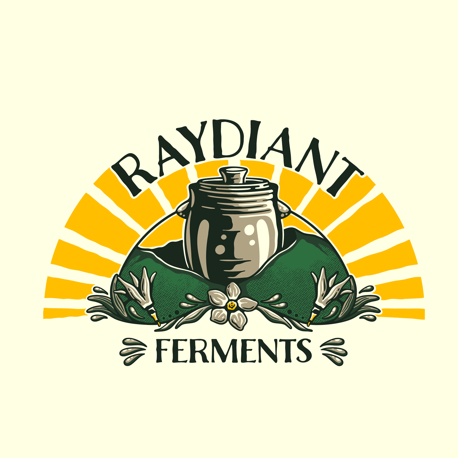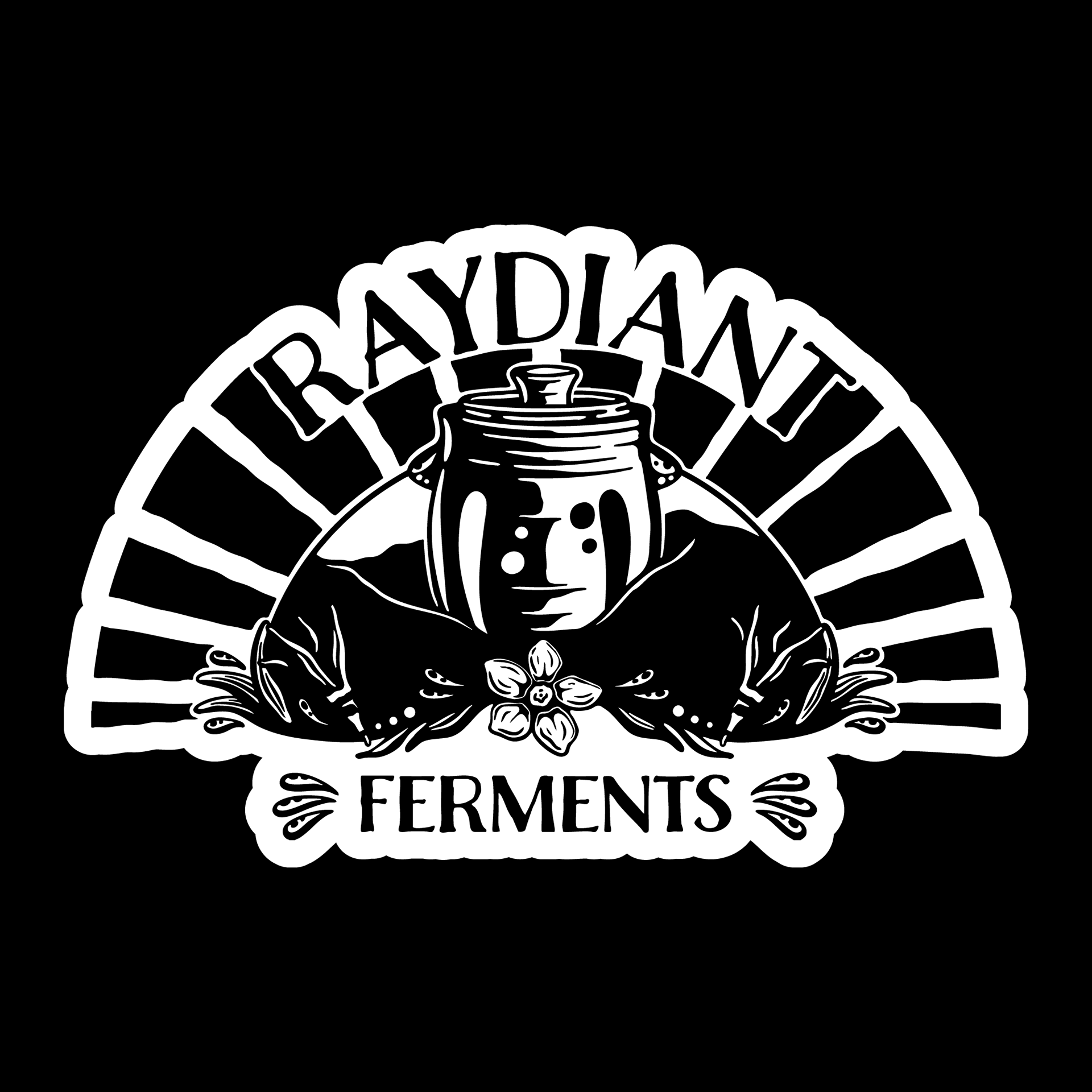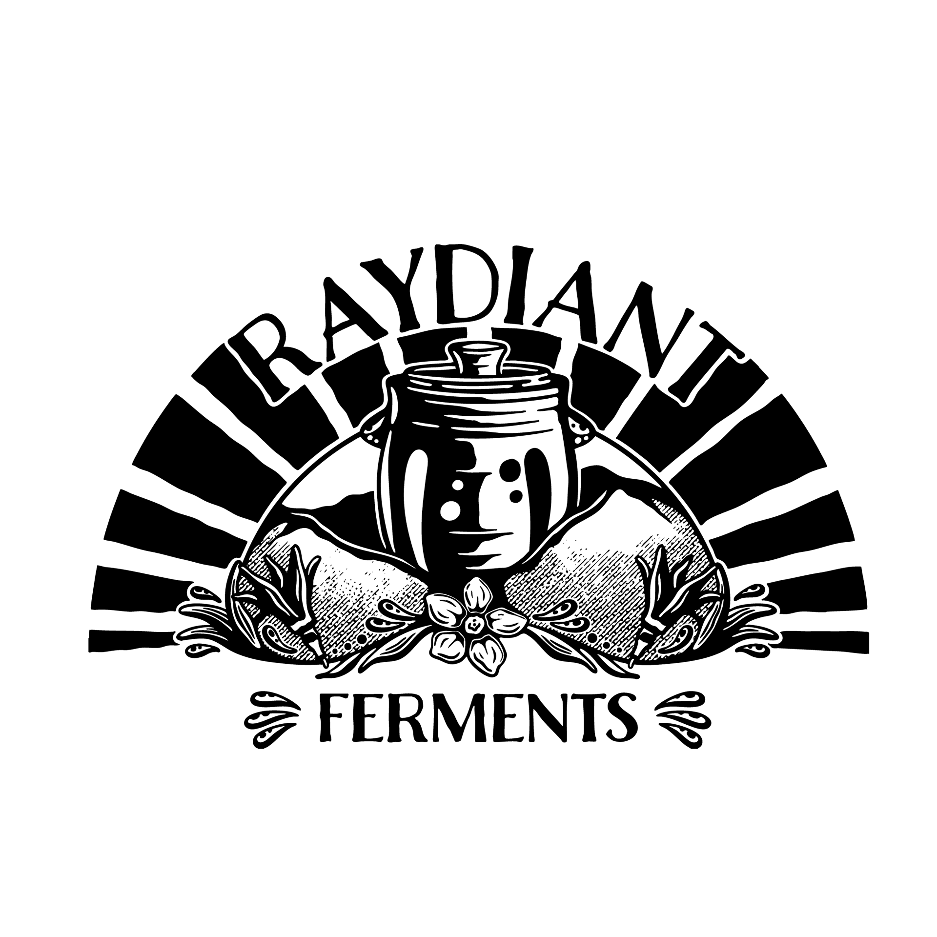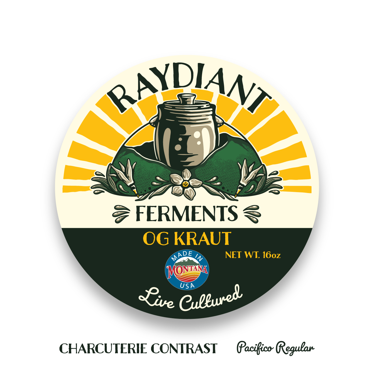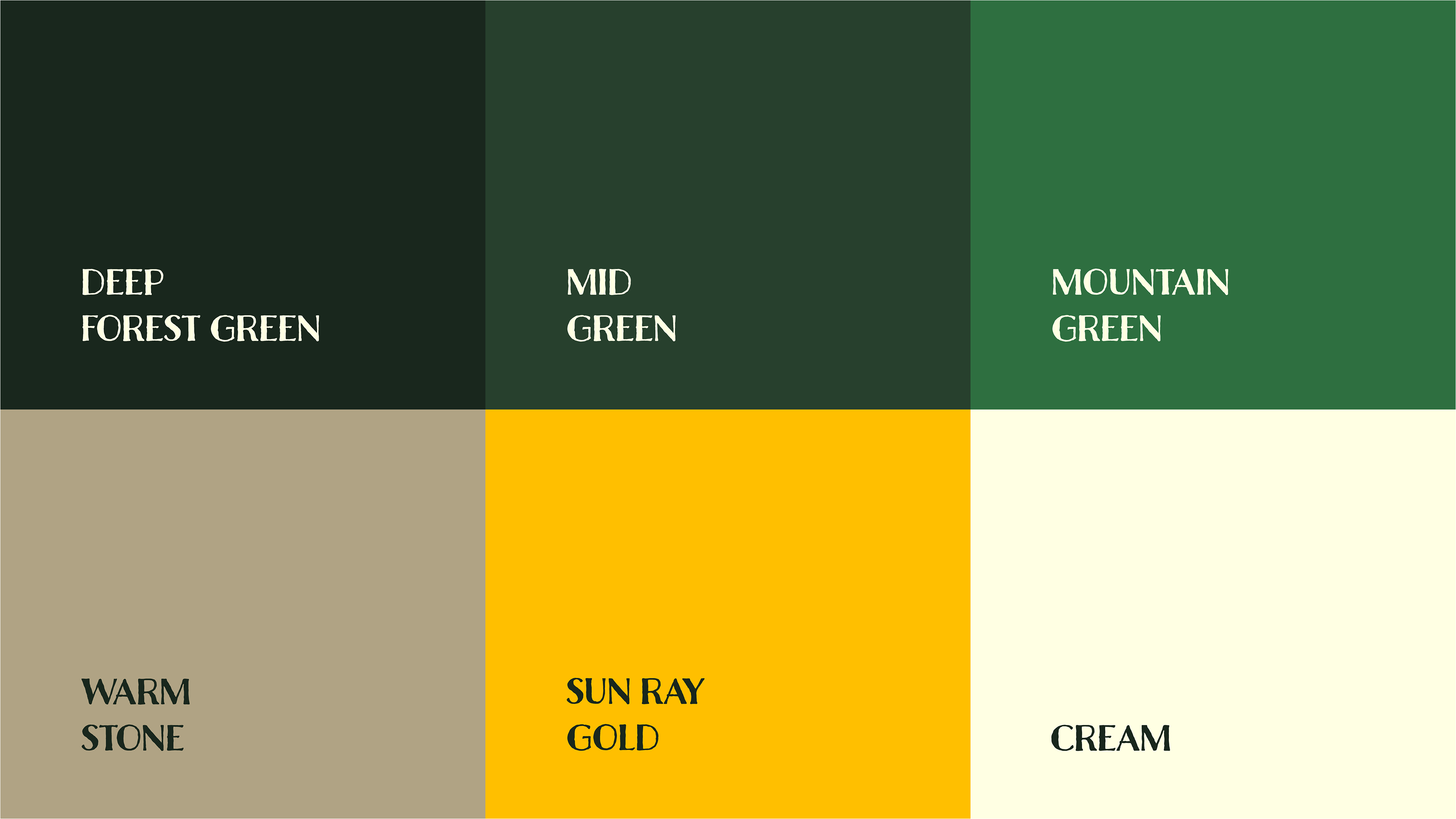
I designed the logo for Raydiant Ferments to reflect the warmth, craftsmanship, and Montana roots behind the brand. The owner initially came in with an AI-generated logo, but wanted something that felt more human and handcrafted, which became a key direction for the project. Inspired by early morning light over Montana landscapes, I created a simplified, badge-style mark with a hand-drawn feel that still holds up clearly at small sizes. The custom arched lettering gives it a vintage, approachable vibe, while the earthy green, warm gold, and cream palette helps communicate a natural, premium product.
Beyond the logo, I also designed labels for all nine SKUs in the product line, including setting up production-ready dielines to ensure everything printed cleanly and consistently. The final logo system includes a primary mark, a simplified icon, and a flexible lockup, making it easy to use across everything from small labels to signage while keeping the brand feeling cohesive and authentic.
For this design process, I created a hand-drawn logo for a small-batch fermentation company based in Missoula, Montana